2024
KEELAN TRAVEL AND TOURS
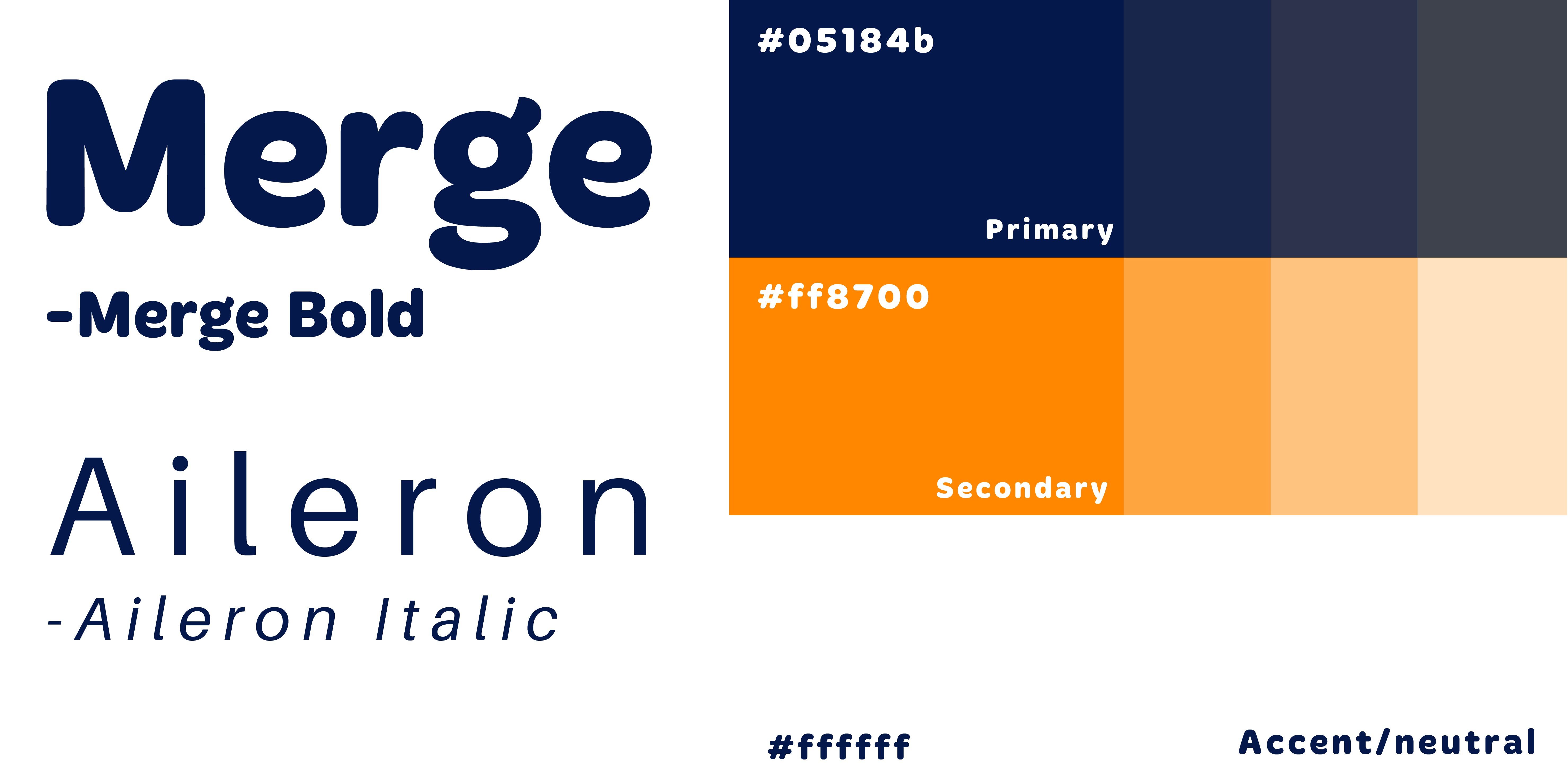
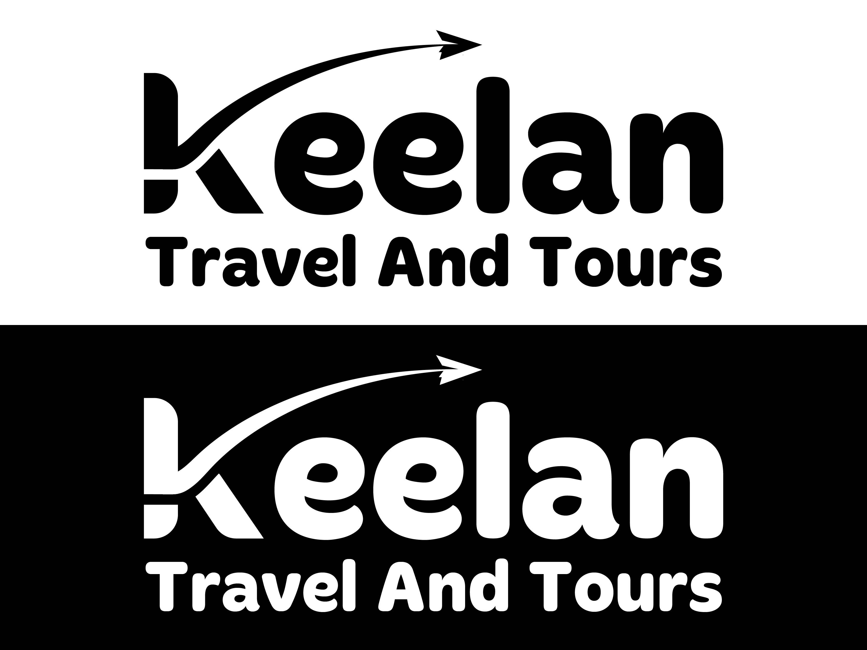
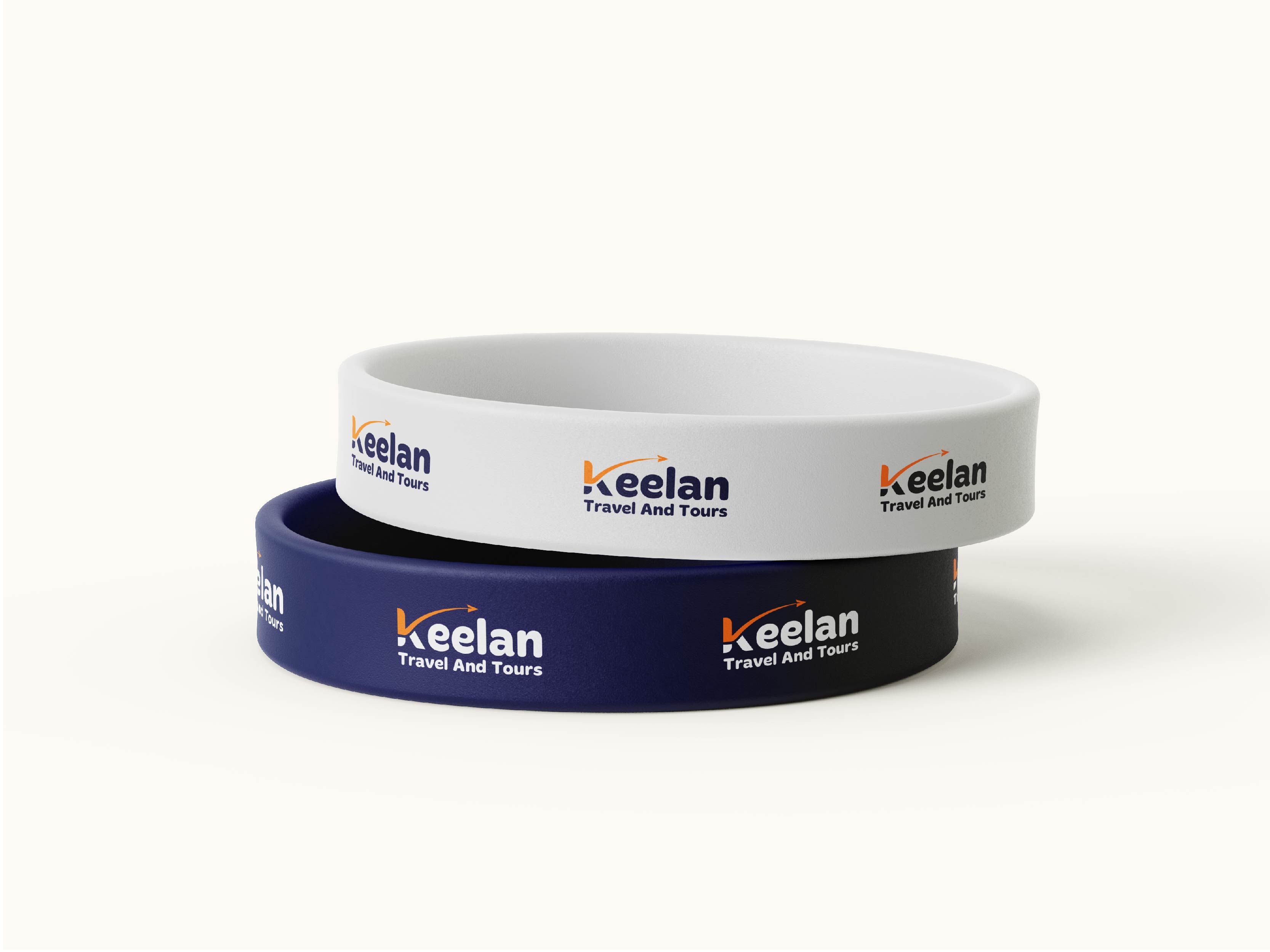
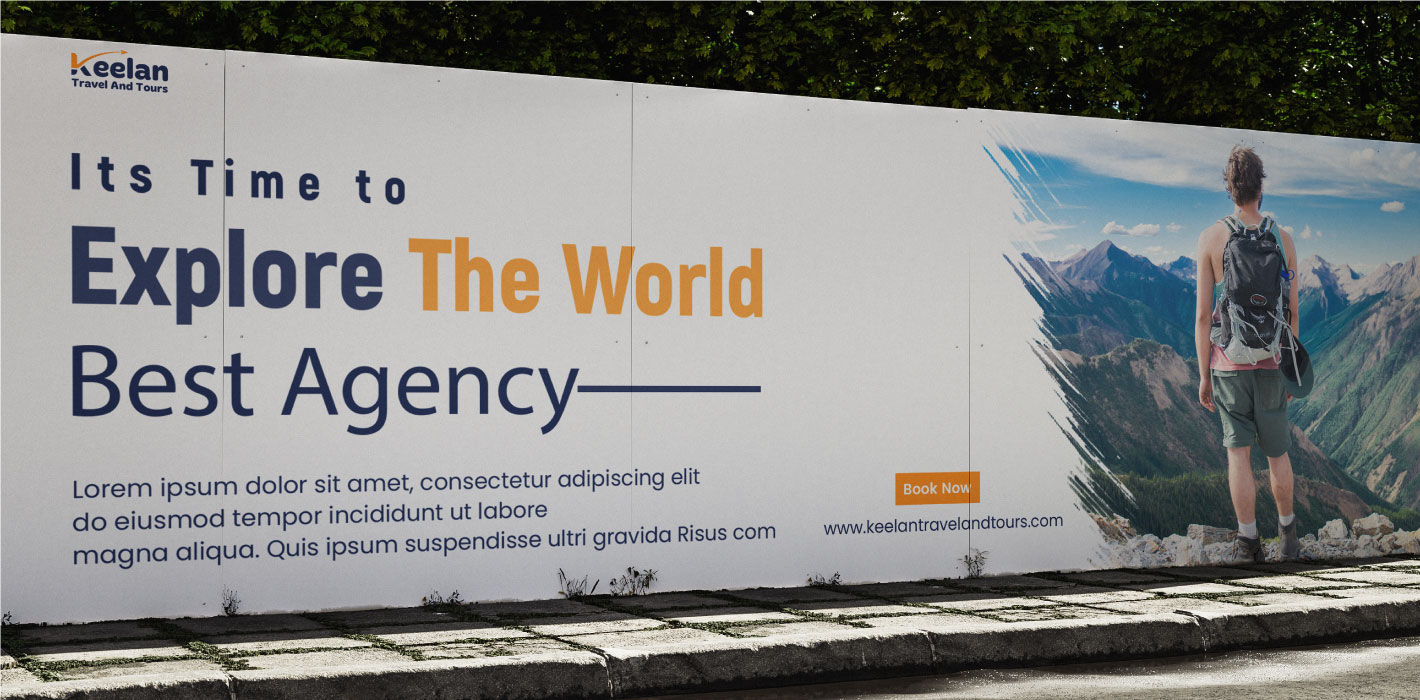
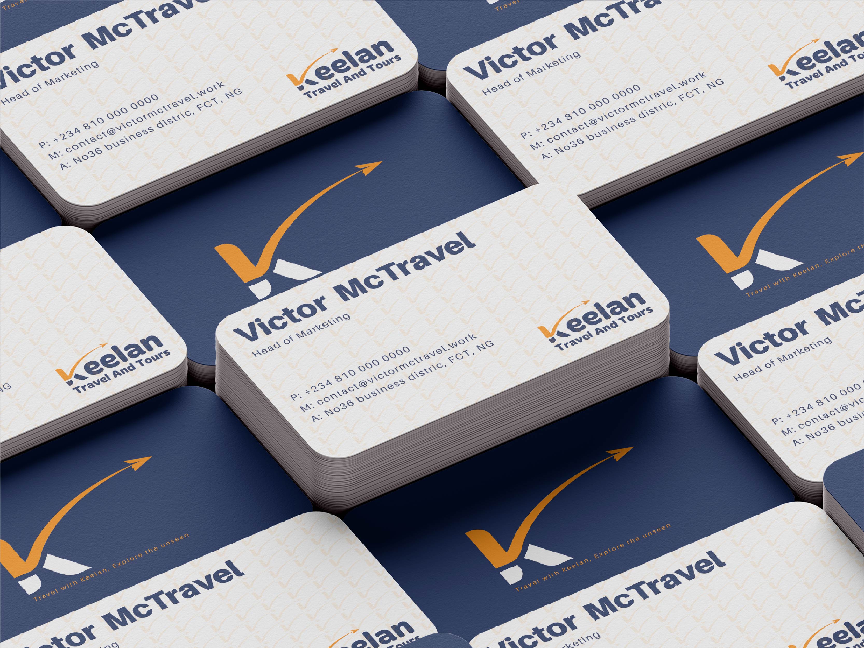
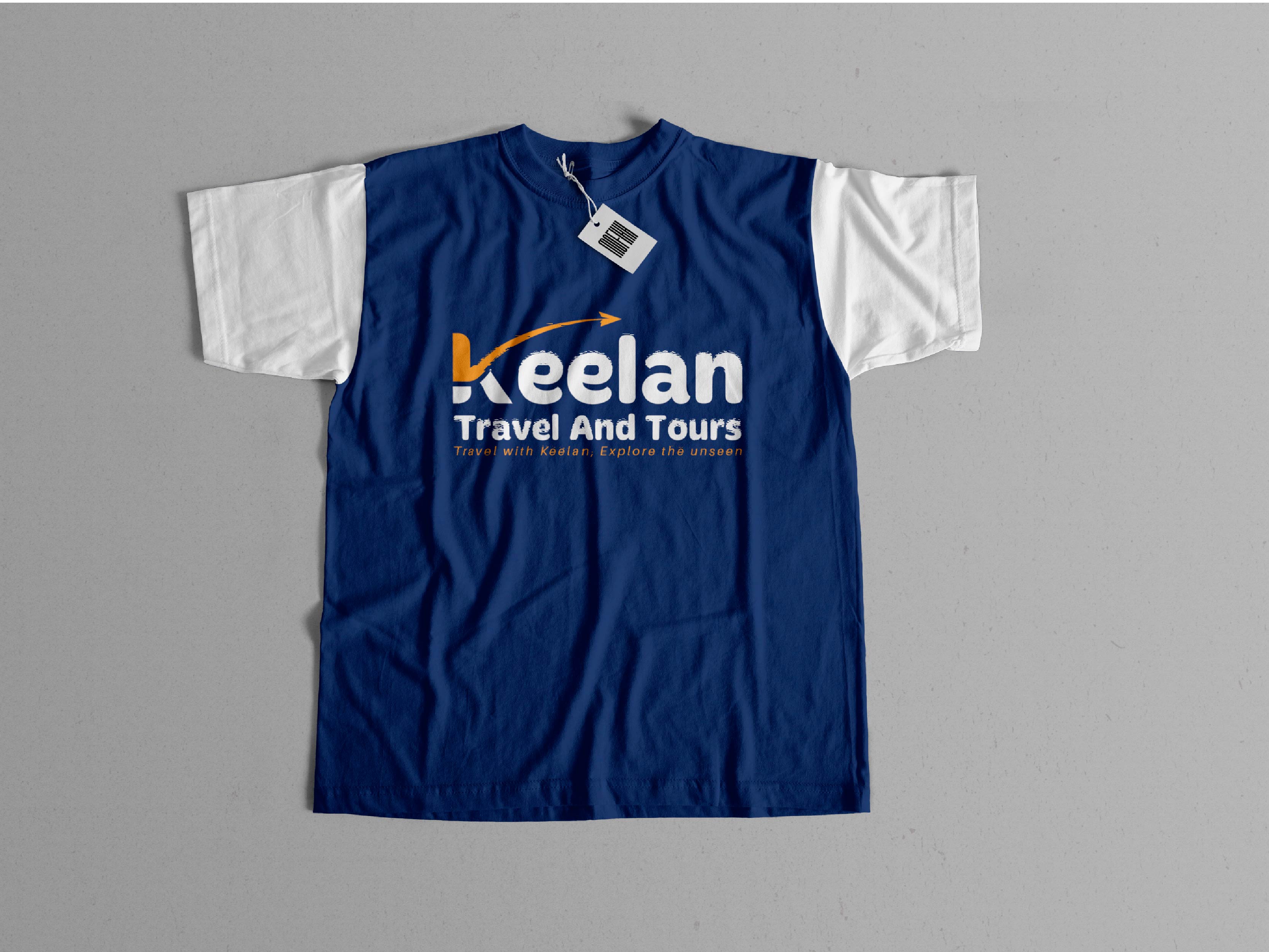
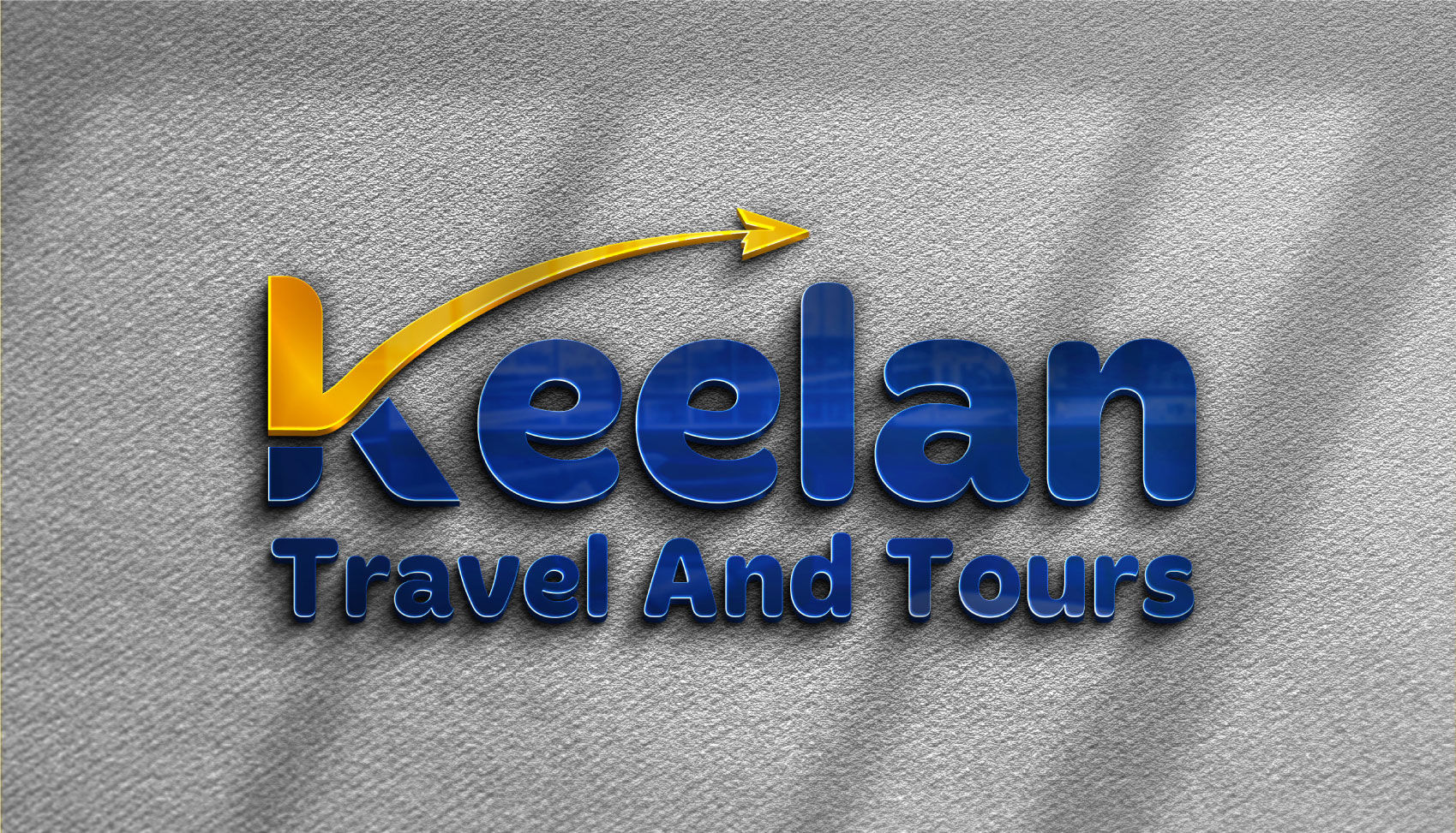
Keelan Travel and Tours needed a fresh, modern identity that captured the spirit of adventure while communicating trust and professionalism. From the moment I received the brief, the vision was immediate. It’s one of those rare projects where the idea formed almost instantly—if there were a record for my fastest concept development, this would probably hold the title. The design revolves around a bold, clean wordmark that makes the brand name easily recognizable. I introduced a curved, upward swoosh extending from the letter “K” to evoke a sense of motion, progress, and forward-thinking energy—key themes in the travel industry. To make the logo stand out, I replaced the standard aircraft icon with a paper plane, giving it a unique and friendly personality without losing its connection to travel. Color played an important role too. I paired a deep navy blue to anchor the brand in professionalism and reliability, with a vibrant orange that adds warmth, excitement, and energy. Together, the two create a balanced visual identity that feels both premium and inviting. For typography, I chose Merge Bold for its strength and legibility, while Aileron supports the brand across applications like ads and business cards. What makes this project memorable for me is how naturally everything came together—from the font selection to the final layout. It’s a clean, scalable design that works across digital and print, perfectly aligned with the spirit of exploration that defines Keelan Travel and Tours.